A lot of work has gone into the CloudStack UI recently, and it is now a modern, role-based UI that not only gives a fresh look to CloudStack but also makes development and customisation much easier. In this blog, I provide guidance on how to customise the UI, and have classified customisation into two categories – basic and advanced.
Basic Customisations
Users can customise the UI by means of this configuration file: /etc/cloudstack/management/config.json to modify theme, logos, etc. as required. These changes can be made while the CloudStack management server is running, and the changes can be seen immediately with a browser refresh.
The configuration file provides the following properties for basic customisation:
| Property | Description |
| apiBase | Changes the suffix for the API endpoint |
| docBase | Changes the base URL for the documentation |
| appTitle | Changes the title of the portal |
| footer | Changes the footer text |
| logo | Changes the logo top-left side image |
| banner | Changes the login banner image |
| error.404 | Changes the image of error Page not found |
| error.403 | Changes the image of error Forbidden |
| error.500 | Changes the image of error Internal Server Error. |
To change the logo, login banner, error page icon, documentation base URL, etc. the following details can be edited in config.json:
"apiBase": "/client/api",
"docBase": "http://docs.cloudstack.apache.org/en/latest",
"appTitle": "CloudStack",
"footer": "Licensed under the <a href='http://www.apache.org/licenses/' target='_blank'>Apache License</a>, Version 2.0.",
"logo": "assets/logo.svg",
"banner": "assets/banner.svg",
"error": {
    "404": "assets/404.png",
    "403": "assets/403.png",
    "500": "assets/500.png"
}
Theme Customisation
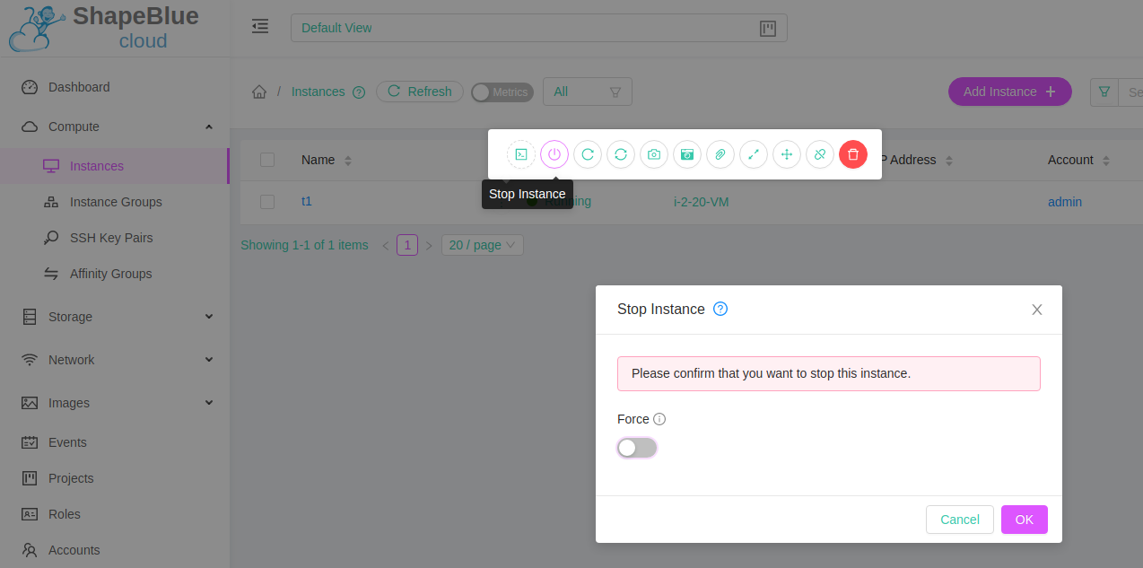
The customisation of themes is also possible, such as modifying banner width or general color. This can be done by editing the “theme” section of the config.json file. This section provides the following properties for customisation:
| Property | Description |
| @logo-background- | Changes the logo background color |
| @project-nav-text-color | Changes the navigation menu background color of the project |
| @project-nav-text-color | Changes the navigation menu background color of the project view. |
| @navigation-background-color | Changes the navigation menu background color |
| @primary-color | Changes the major background color of the page (background button, icon hover, etc). |
| @link-color | Changes the link color |
| @link-hover-color | Changes the link hover color |
| @loading-color | Changes the message loading color and page loading bar at the top page |
| @success-color | Changes success state color |
| @processing-color | Changes processing state color. Exp: progress status |
| @warning-color | Changes warning state color |
| @error-color | Changes error state color |
| @heading-color | Changes table header color |
| @text-color | Change in major text color |
| @text-color-secondary | Change of secondary text color (breadcrumb icon) |
| @disabled-color | Disable state color (disabled button, switch, etc) |
| @border-color-base | Change in major border color |
| @logo-width | Change the width of the logo top-left side |
| @logo-height | Change the height of the logo top-left side |
| @banner-width | Changes the width of the login banner |
| @banner-height | Changes the height of the login banner |
| @error-width | Changes the width of the error image |
| @error-height | Changes the height of the error image |
Some example theme colors:
- Blue: #1890FF
- Red: #F5222D
- Yellow: #FAAD14
- Cyan: #13C2C2
- Green: #52C41A
- Purple: #722ED1
This example shows the configuration changes necessary in /etc/cloudstack/management/config.json to customise logo and colors:
{
  "apiBase": "/client/api",
  "docBase": "http://docs.cloudstack.apache.org/en/latest",
  "appTitle": "Shapeblue Cloud",
  ...
  "logo": "assets/customlogo.svg",
  ...
  "theme": {
    ...
    "@primary-": "#dd55ff",
    ...
    "@warning-color": "#ff2a7f",
    ...
    "@text-color": "#37c8ab
",

...
Links to Contextual Help
The UI provides support for showing links to contextual help in pages and forms. By default, the links are to the official CloudStack documentation. For each section item (menu items in the left pane of the UI such as Instances, Volumes, Templates, etc.) or UI form there is a suffix defined in the code in the Javascript file for the section as docHelp property. This suffix is added to the docBase property defined in the config file / and the resulting URL is set as the link for a contextual help button.
The docHelpMappings property can be used to provide a list of override mappings for different suffix values, and to change a particular help URL, a mapping can be added in the configuration using the suffix part of the URL. By default, `docHelpMappings` lists all existing documentation URL suffixes, mapped to themselves, in the configuration file that are used in the code. This list of documentation URL suffixes can also be found in the CloudStack documentation.
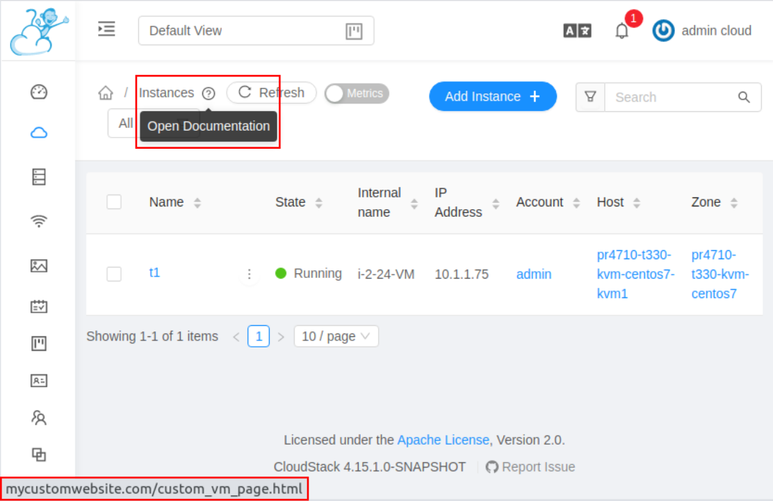
In the example below, we change the docBase and docHelpMappings values to show a custom link for contextual help. By default, docBase is set to http://docs.cloudstack.apache.org/en/latest and contextual help on Instances page links to http://docs.cloudstack.apache.org/en/latest/adminguide/virtual_machines.html.
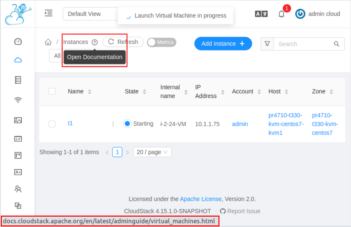
To make Instances page link to http://mycustomwebsite.com/custom_vm_page.html, docBase can be set to http://mycustomwebsite.com and a docHelpMapping can be added for adminguide/virtual_machines.html as custom_vm_page.html.
Changes in /etc/cloudstack/management/config.json:
{
  ...
  "docBase": http://mycustomwebsite.com,
  ...
  "docHelpMappings": {
    "adminguide/virtual_machines.html": "custom_vm_page.html",
    ...
  },
  ...
}
Plugin support
The CloudStack UI also supports custom plugins. Changes in /etc/cloudstack/management/config.json can show a list of custom plugins that would allow showing custom in an iframe. Custom HTML pages can be used for showing some static content to the users while an HTTP service running on an internally deployed web server or an external website can be used to show any dynamic content.
The example below adds two custom plugins in the UI with their own navigation sections. The first plugin shows a custom HTML file. The second plugin shows CloudStack website within the UI.
...
  "plugins": [
    {
      "name": "ExamplePlugin",
      "icon": "appstore",
      "path": "example.html"
    },
    {
      "name": "ExamplePlugin1",
      "icon": "fire",
      "path": "https://cloudstack.apache.org/"
    }
  ]
}
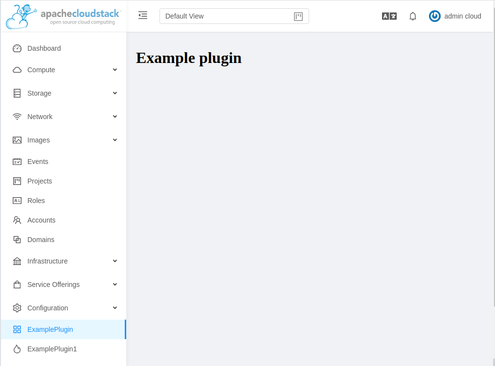
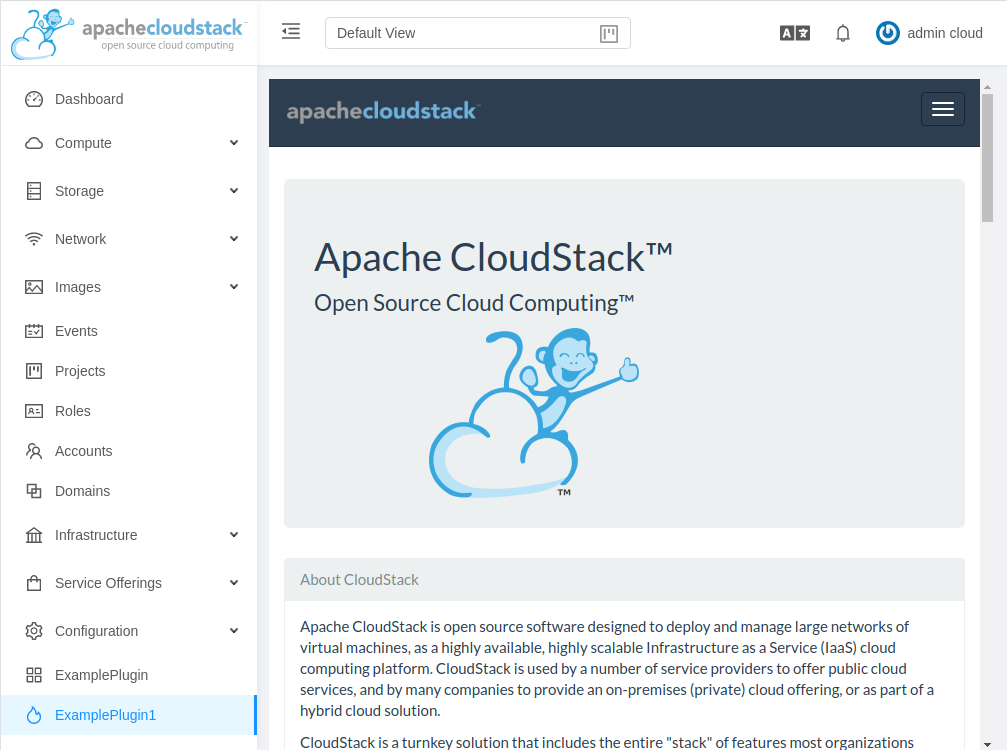
An icon for the plugin can be chosen from Ant Design icons listed at Icon – Ant Design Vue.
For displaying custom HTML in the plugin, an HTML file can be stored in the CloudStack management server’s web application directory on the server, i.e., /usr/share/cloudstack-management/webapp and path can be set to the name of the file. For displaying an HTTP service or a web page, URL can be set as the path of the plugin.
Advanced Customisation
Advanced UI customisation is possible by changing source code files that define rules for different elements in the UI, and requires building CloudStack from the source code (available at github.com/apache/cloudstack). This will require some experience in JavaScript, VueJS and nodejs. Also, the UI is built using Ant Design components, so knowledge of ant-design-vue & its principles would help greatly. More information about Ant Design Vue can be found here.
The source code can be obtained either from the CloudStack website in tarball form or from the Apache Cloudstack Github repository. For example, using git, the repository can be cloned locally:
git clone https://github.com/apache/cloudstack.git
# To checkout specific release TAG
cd cloudstack
git fetch --tags
git checkout TAG
# CloudStack 4.15.0.0 has tag named 4.15.0.0 on Github, to checkout the same
git checkout 4.15.0.0
After obtaining the CloudStack source code, the UI code can be found in the UI sub-directory. For different customisations, changes can be made in the code and then npm can be used to create a static web application. Finally, one would copy the built UI to the webapp directory on the management server host. Building the UI will require installing dependencies for nodejs, npm and VueJS. The necessary steps for building UI from source code are dependent on the host operating system and can be found in the CloudStack UI development documentation. The instructions below have been tested on Ubuntu 20.04.
Install dependencies:
sudo apt-get install npm nodejs
# Install system-wide dev tools
sudo npm install -g @vue/cli npm-check-updates
Fetch npm package dependencies and build:
cd ui
npm install
npm run build
Copy built UI to webapp directory on the management server host:
cd dist
scp -rp ./ {user-on-management-server}@{management-server}:/usr/share/cloudstack-management/webapp/
# Access UI at {management-server}:8080/client in browser
Alternatively, packages can be rebuilt for the desired platform. UI will be packaged in cloudstack-ui package. Refer to the CloudStack packaging documentation for more details. For testing changes during development npm can be started without build:
cd ui
npm install
npm run serve
# Or run: npm start
Examples of advanced customisations can be seen below.
Icon changes
Custom icons can be added in the directory cloudstack/ui/src/assets/icons
Once a new icon file (preferably an SVG file) is placed in the directory it can be imported in the Javascript (.js) file for the corresponding section item (menu items in the left pane in the UI).
A list of available Ant Design icons can be found at https://www.antdv.com/components/icon/
The example below shows changing icon for Compute menu and Instances sub-menu:
![]()
New files added named customcompute.svg and custominstances.svg added in the cloudstack/ui/src/assets/icons/ directory:
⇒ ls cloudstack/ui/src/assets/icons/ -l
total 36
-rw-rw-r-- 1 shwstppr shwstppr 3008 Feb 16 15:55 cloudian.svg
-rw-r--r-- 1 shwstppr shwstppr 483 Oct 26 1985 customcompute.svg
-rw-r--r-- 1 shwstppr shwstppr 652 Oct 26 1985 custominstances.svg
-rw-rw-r-- 1 shwstppr shwstppr 10775 Feb 16 15:55 debian.svg
-rw-rw-r-- 1 shwstppr shwstppr 10001 Feb 16 15:55 kubernetes.svg
cloudstack/ui/src/config/section/compute.js updated to import and set a new icon for the menu items,
...
import kubernetes from '@/assets/icons/kubernetes.svg?inline'
import store from '@/store'
+import customcompute from '@/assets/icons/customcompute.svg?inline'
+import custominstances from '@/assets/icons/custominstances.svg?inline'

export default {
   name: 'compute',
   title: 'label.compute',
-  icon: 'cloud',
+  icon: 'customcompute',
   children: [
     {
       name: 'vm',
       title: 'label.instances',
-      icon: 'desktop',
+      icon: 'custominstances',
       docHelp: 'adminguide/virtual_machines.html',
       permission: ['listVirtualMachinesMetrics'],

...
After rebuilding and installing the new packages, the UI will show the new icon(s):
![]()
Localization
Language translation files for text in the UI are placed in cloudstack/ui/public/locales/. A copy of the file cloudstack/ui/public/locales/en.json can be made in the same directory to include all translation keys, following the naming convention for locales (for example, el will be for Greek, but el_CY and el_GR can be other variants as well).
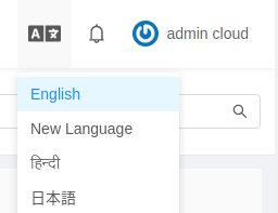
Once string keys are translated, changes can be made in the file cloudstack/ui/src/components/header/TranslationMenu.vue for the new language to be displayed as an option in the Languages dropdown in the UI. This example shows a dummy locale being added in the UI.
New file added in cloudstack/ui/public/locales/ with name zz.json:
⇒ ls cloudstack/ui/public/locales/ -lr
total 3112
-rw-rw-r-- 1 shwstppr shwstppr 196471 Feb 25 11:42 zz.json
-rw-rw-r-- 1 shwstppr shwstppr 186117 Feb 16 15:55 zh_CN.json
-rw-rw-r-- 1 shwstppr shwstppr 354705 Feb 16 15:55 ru_RU.json
...
Changes necessary in cloudstack/ui/src/components/header/TranslationMenu.vue to add the new language with above translation file:
...
       :selectedKeys="[language]"
       @click="onClick">
       <a-menu-item key="en" value="enUS">English</a-menu-item>
+      <a-menu-item key="zz" value="hi">New Language</a-menu-item>
       <a-menu-item key="hi" value="hi">हिन्दी</a-menu-item>
       <a-menu-item key="ja_JP" value="jpJP">日本語</a-menu-item>
       <a-menu-item key="ko_KR" value="koKR">한국어</a-menu-item>
...
Upon re-building and installing new packages, the UI will show the newly added language in the Languages dropdown:
Other Modifications
There could be several use-cases that require tweaking the UI to enable/disable functionality or to hide or show different elements in the UI. For such modifications, a thorough understanding of Javascript and Vue.js will be required. The development section on the CloudStack repository can be referred to for making such advanced changes.
The following example shows hiding Register Template from URL action from Templates view in the UI for User role:

The templates sub-menu is defined in the Images section cloudstack/ui/src/config/section/image.js, and a list of actions can be defined for each child of the section item. The Register Template from URL action can be found in the actions property with label value label.action.register.template. To hide the action for User role accounts, we can use show property for the action. It can be set as follows:
...
       actions: [
 {
   api: 'registerTemplate',
   icon: 'plus',
   label: 'label.action.register.template',
   docHelp: 'adminguide/templates.html#uploading-templates-from-a-remote-http-server',
           listView: true,
           popup: true,
+          show: (record, store) => {
+            return (['Admin', 'DomainAdmin'].includes(store.userInfo.roletype))
+          },
           component: () => import('@/views/image/RegisterOrUploadTemplate.vue')
         },
...
After making these changes, the Register Template from URL action is shown only for Admin and Domain Admin accounts.

It should be considered that removing elements from the UI does NOT restrict a users ability to access the functionality through the CloudStack API and should, therefore, only be used in a usability context, not a security context. CloudStacks Roles based security model should be used if a user is to be prohibited from accessing functionality.
Conclusion
The UI is no longer part of the core CloudStack Management server code (giving a much more modular and flexible approach) and is highly customisable, with even advanced changes possible with some knowledge of JS and Vue.js. The UI was designed keeping simplicity and user experience in mind.
The UI is designed to work across all browsers, tablets and phones. From a developer perspective, the codebase should be about a quarter that of the old UI and, most importantly, the Vue.JS framework is far easier for developers to work with.
Abhishek Kumar is a software engineer by profession. His personal interests and hobbies are technology, politics and sports. Abhishek is experienced in development and management of a variety of desktop and mobile applications. He has a particular interest in mobile application development, designing and developing highly interactive and intuitive mobile, desktop applications GUI.
Abhishek became part of ShapeBlue in 2019 and is currently an active Apache CloudStack Committer.
You can learn more about Abhishek and his background by reading his Meet The Team blog.
